The DemandStage teardown scores B2B webinar registration pages against five checks, one point each, with half a point for getting halfway. This one is the registration page for Wiz’s AI for Security Summit, a live webinar on October 20, 2026, with speakers from Wiz, Perplexity and Figma. The page was captured on October 12, 2026, so details may have changed since.
The score: 1 out of 5. The lesson in one line: when the guest companies are the draw, put them in the headline.
What works
- Real practitioners, right under the form. Four speaker cards with headshots: Rami McCarthy of Wiz, Adel Karimi of Perplexity, and Lamarr Henry and Rohan Sharma of Figma. Below them, the agenda gives every talk a time, a title and an abstract.
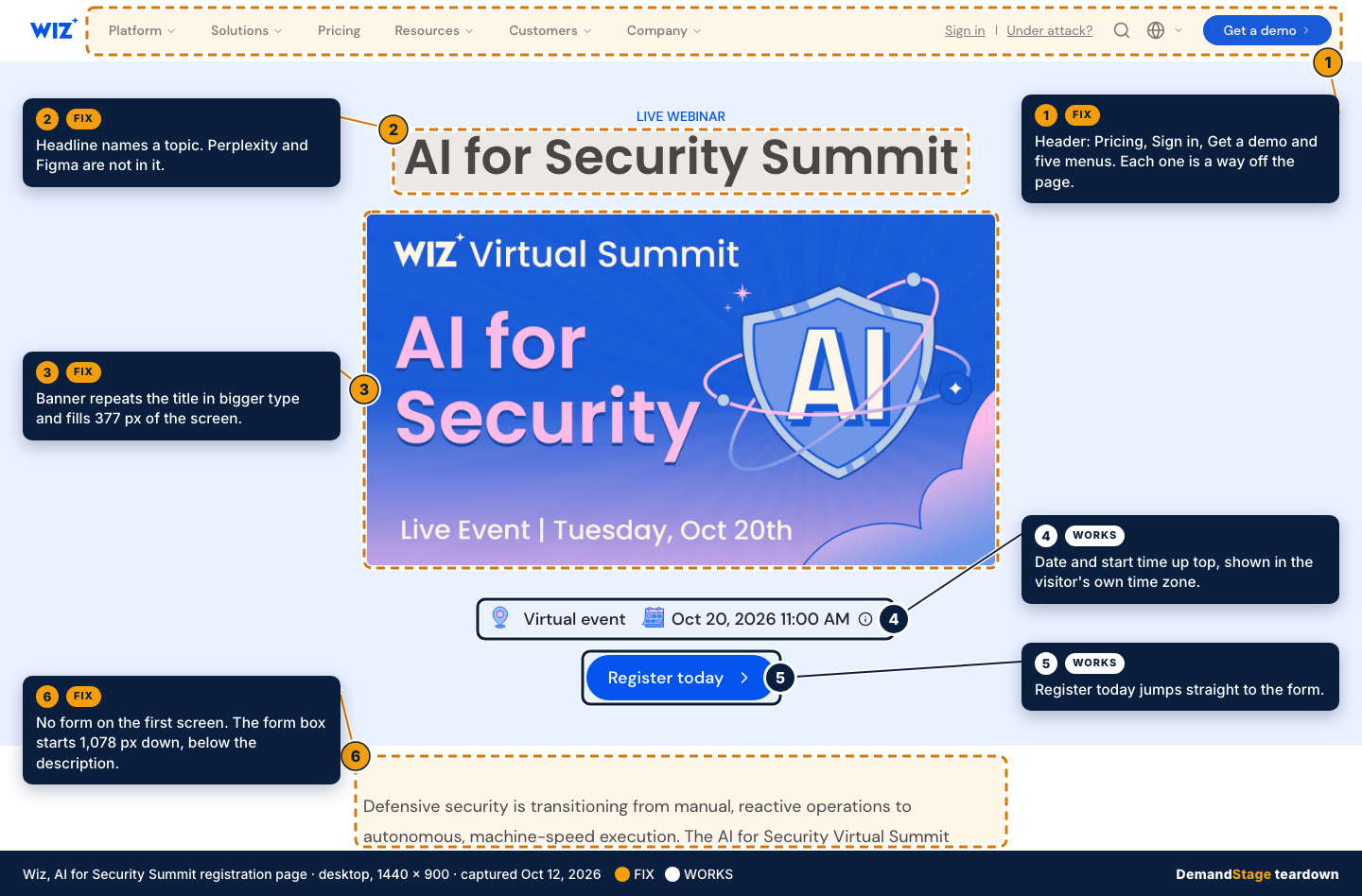
- Sessions in three time zones. The first form field is a session picker: the live event at 11:00 AM ET on October 20, an EMEA broadcast on October 22 and an APJ broadcast on October 27.
- The date and a register button come first. The date line under the banner shows the start time in the visitor’s own time zone: 11:00 AM in New York, 8:00 AM in Los Angeles. The “Register today” button on the first screen jumps straight to the form.
The scorecard
The five checks follow the registration page checklist published by Webinar University. Here is how the Wiz page did on each.
| Check | Result | Points |
|---|---|---|
| 1. Outcome-led headline | Miss | 0 |
| 2. Three form fields, maybe four | Miss | 0 |
| 3. One exit only | Miss | 0 |
| 4. Speaker credibility near the form | Halfway | 0.5 |
| 5. Form reachable on a phone | Halfway | 0.5 |
| Total | 1 of 5 |
1. Outcome-led headline: miss
The headline is “AI for Security Summit.” The banner under it repeats “AI for Security” in larger type. Both name a topic. Perplexity and Figma appear only in the speaker cards and the agenda, both below the form. The clearest outcome on the page sits inside one agenda abstract: attendees “walk away with practical AI workflows to scale your own security program.”
Why it matters: the headline is the first line a visitor reads. A topic tells them what the event covers. An outcome, or a guest they already respect, gives them a reason to spend the time.
The fix: lead with the guests and the result, for example “How Perplexity and Figma put AI agents to work in security.” Keep “AI for Security Summit” as the eyebrow.
2. Three form fields, maybe four: miss
The form has nine fields, and seven carry the required asterisk: session, first name, last name, work email, company, job title and phone number. Job title is free text. Country, a flag picker next to the phone field, is optional, and so is an open notes box at the end. The button says “Submit.”
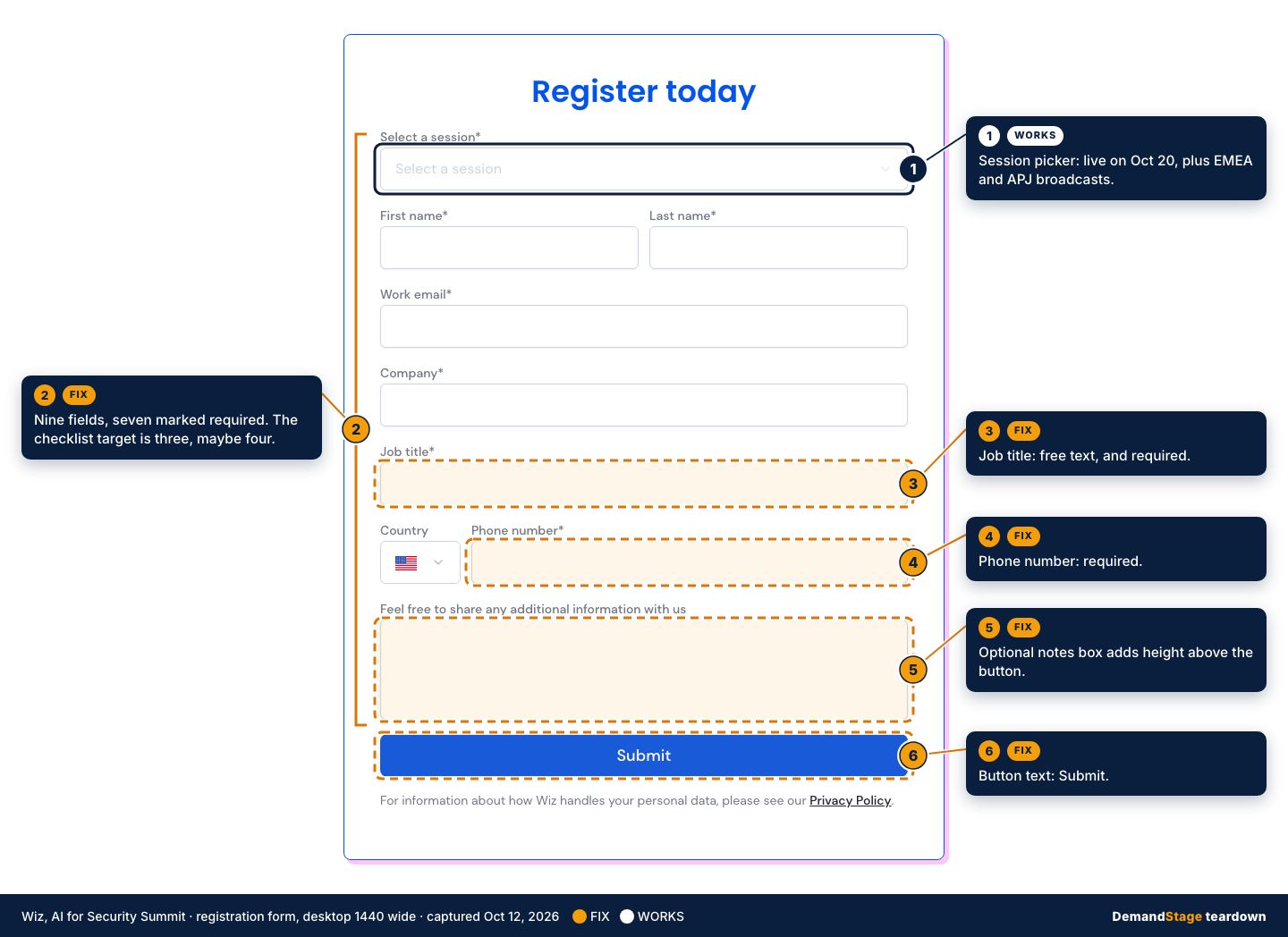
Why it matters: somewhere around the fourth field, a signup starts to feel like an application. A required phone number tells a visitor a sales call is coming. A free-text job title often comes back as “Manager” or a typo, which makes it hard to route on.
The fix: keep the session picker, first name, work email and company. Drop the phone field, fill in title and country later through enrichment, and move the notes question to the confirmation page. Then change “Submit” to something like “Save your seat.”
3. One exit only: miss
The HTML the server sends contains 41 links, pointing to 39 different destinations. The header carries five: the logo, Pricing, Sign in, Under attack? and Get a demo. The form has one, the privacy policy. Each speaker card has a LinkedIn icon, four in all, and the footer adds 31 more. That count leaves out the five header menus (Platform, Solutions, Resources, Customers and Company), which open further links on hover.
Why it matters: a registration page has one job, so every other link is a way to leave before registering. As enterprise site templates go, this one is lean. The checklist still allows only one link besides the form, the privacy policy.
The fix: an unlinked logo, the form and the privacy link. A security vendor could fairly keep “Under attack?” as a second exit for visitors in the middle of an incident. The menus, the demo button and the footer can go.
4. Speaker credibility in about 50 words near the form: halfway
The Speakers section comes directly after the form. Each of the four cards shows a headshot, a name and a “title at company” line, 27 words for all four. It skips the proof line: one sentence on why this person is worth the time. The checklist also caps the page at two speakers, and this page has four.
Why it matters: people register for people. In B2B the real question is whether the speaker knows something the visitor doesn’t, and a job title alone rarely answers it.
The fix: add one proof line per speaker. The agenda abstracts already hold the material, such as the agent-based code review that the Figma talk describes. Lifting the two guest companies into the headline also takes pressure off the speaker block.
5. Form reachable on a phone: halfway
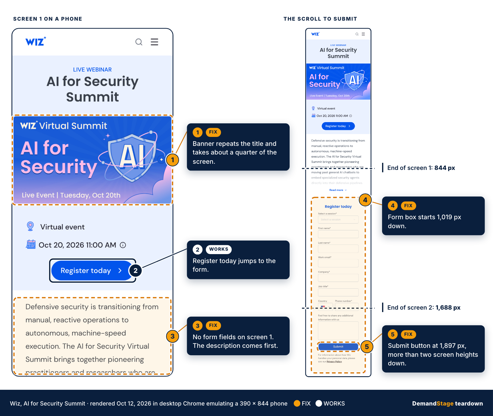
This check used a rendered view: the page was opened on October 12 in desktop Chrome emulating a 390 by 844 pixel phone screen with an iPhone user agent, not on a physical device. The layout is a single column, nothing covers the form, and the “Register today” button on the first screen jumps straight to it. That earns the half point.
Without that button, the scroll is long. The first screen holds the header, the title, a banner that repeats the title, the date, the button and the start of the description. The form box starts 1,019 pixels down. The Submit button sits 1,897 pixels down, more than two screen heights from the top.
Why it matters: every screen of scrolling is another chance to close the tab before reaching the button.
The fix: hide the banner on small screens, or move it below the form. Cutting the form to four fields, as in check 2, shortens the scroll further.
Steal this: the 5-minute audit for your next registration page
- Read only the headline. Does it promise an outcome, or name the guests people would come for?
- Count the form fields. More than four? Cut, and collect the rest after signup.
- Count every link that isn’t the register button. Anything beyond a logo and a privacy link is an exit.
- Find the speakers. Face, name, title and one line of proof, close to the form?
- Open the page on a phone and count the thumb-scrolls to the button.
Why this matters for B2B pipeline
Traffic to a registration page usually costs money before it arrives: an email send, an ad, a partner’s list. For a B2B team, registrants are the start of the pipeline a webinar is meant to build, so a page that loses them makes every promotion dollar work harder. None of these fixes needs a redesign.
DemandStage was founded by David Davis, who has produced more than a thousand enterprise B2B webinars, and the five checks come out of that work. For teams that want webinar programs run end to end, from the registration page and promotion sequence through live production and follow-up, the DemandStage services page lists what each engagement covers.